Are you frustrated with the way your interior paint color turned out? Did it not match what you envisioned or look different once it was on the walls? You might be experiencing the effects of poor lighting or room dimensions. But don’t worry, you can still fix these mistakes and get the perfect color you desire.
In this article, we will explore how to correct interior paint color mistakes caused by poor lighting or room dimensions. Understanding the impact of lighting and considering the room’s dimensions are essential in achieving your desired color outcome. We’ll also discuss how to test paint samples in the room, use color theory to your advantage, and make adjustments as needed. With these tips, you’ll be able to achieve a beautiful and cohesive interior design that reflects your personal style.
Understand the Impact of Lighting
You’ll want to pay attention to the lighting in your room, as it can have a big impact on the color of your paint. Natural lighting, such as sunlight, tends to show colors more accurately than artificial lighting. With natural light, you’ll be able to see the true hue and depth of your paint color.
On the other hand, artificial lighting can change how colors appear. The color temperature of light bulbs can influence how warm or cool a color looks. For example, if you use warm-toned bulbs with a blue-toned paint color, it may make the walls look greenish. It’s important to consider both natural and artificial lighting when selecting a paint color and making corrections if needed.
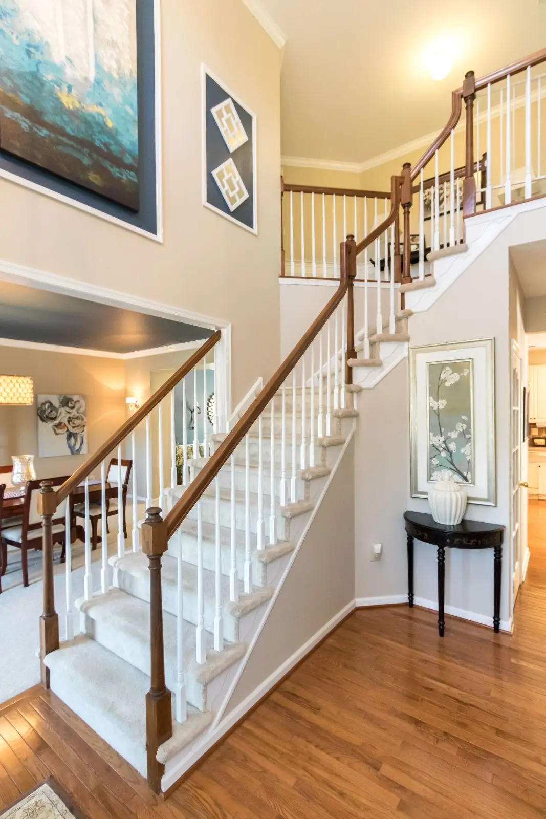
Consider the Room’s Dimensions
When assessing the space, it’s essential to take into account its size and shape. The dimensions of a room can significantly impact how colors appear on walls. For instance, if you have a small space, painting it with dark colors may make it look even smaller and cramped. Instead, opt for lighter shades that can create an illusion of more space.
Furniture placement is another factor to consider when selecting paint colors. If your furniture is predominantly neutral or light-toned, you can choose bolder hues for your walls without overwhelming the room’s overall aesthetic. However, if your furnishings are already in bright colors or patterns, it’s best to stick to more subdued tones for wall paint. Lastly, don’t forget about wall texture – matte finishes can absorb light and make spaces feel cozier while glossy finishes reflect light and make areas feel brighter and larger. By taking these factors into consideration, you’ll be able to select the perfect color palette that not only complements your interior design but also makes your rooms feel spacious and inviting.
Test Paint Samples in the Room
To really get a feel for how your chosen paint colors will look in your space, it’s a great idea to test out some paint samples right there in the room. This will allow you to see how the color interacts with the natural lighting and artificial lighting in the room, and how it looks against different surfaces such as flooring or furniture. Paint can look drastically different depending on these factors, so it’s important to take them into consideration before committing to a full coat of paint.
When testing out paint samples, be sure to use a sample size that is large enough to get an accurate representation of what the final product will look like. A small swatch may not be enough to give you a full picture of how the color will appear on your walls. Additionally, consider placing the sample in different areas of the room to see how it looks under different lighting conditions. This will help you make an informed decision about which paint color is best suited for your space and ensure that you avoid any mistakes caused by poor lighting or room dimensions.
Use Color Theory to Your Advantage
Using color theory can help you make an informed decision about which shades to choose for your walls and decor. Color psychology is the study of how colors affect human behavior and emotions, which means that choosing the right hues can have a significant impact on the overall mood of your space. For instance, warm colors like red, orange, and yellow are known to stimulate energy and create a cozy atmosphere, while cool tones like blue, green, and purple promote calmness and relaxation.
Another aspect of color theory that can be useful in correcting interior paint mistakes is complementary colors. Complementary colors are those that sit opposite each other on the color wheel and create a striking contrast when paired together. If you find that your current wall color isn’t quite working with the rest of your decor or lighting situation, consider using its complementary shade as an accent instead. Adding pops of contrasting hues through accessories or artwork can help balance out any unwanted undertones in your paint job and bring a fresh look to your space without having to redo the entire room.
Make Adjustments as Needed
You can easily make adjustments to your wall color by trying out different shades and accents until you find the perfect combination that complements your decor and creates the desired mood for your space. Color correcting is not a one-step process, but rather requires some trial and error to get it right. You may need to experiment with different hues, tones, and saturation levels before finding the best match for your room.
If you feel unsure about your choices or are struggling to achieve the look you want, seek professional advice. A color consultant or interior designer can provide valuable insight into how different colors interact with each other and offer suggestions on how to create a cohesive palette. Remember that paint colors can have a significant impact on the overall feel of a room, so it’s worth taking the time to get it just right!
Final Thoughts
If you’ve encountered interior paint color mishaps due to inadequate lighting or room dimensions, fret not! It’s a common occurrence, even among the most skilled individuals. The good news is that there are straightforward solutions available to rectify these mistakes and achieve the desired look.
First and foremost, it’s essential to grasp the impact of lighting on your paint color choice. Natural light has the power to significantly alter how a color appears. Therefore, it’s crucial to consider the direction and intensity of light before making your final decision. Additionally, take into account the dimensions of your room. Darker colors have a tendency to make a space feel smaller, while lighter colors can create the illusion of more space.
Moreover, don’t hesitate to test paint samples directly in the room you intend to paint. This allows you to witness how the color interacts with both natural and artificial light throughout different times of the day. Lastly, let color theory serve as a guide when selecting accent colors. Whether you opt for complementary or contrasting hues for your furniture or decor, color theory can help you achieve a harmonious look.
By adhering to these tips and making necessary adjustments, you’ll be able to rectify any interior paint color blunders and create a beautiful space that truly reflects your personal style. So go ahead and pick up that brush – it’s time to transform your home!
Additionally, consider choosing paint types that offer excellent coverage and a durable finish. This ensures that your freshly painted walls will maintain their appearance for an extended period. Furthermore, selecting an accent color that complements your chosen paint color can enhance the overall visual appeal of the room. So keep these factors in mind while making your paint selections for a truly remarkable outcome.