Are you struggling to choose the right colors for your house interior? Don’t worry, we’ve got you covered! In this article, we’ll provide you with recommendations for house interior color combinations and complementary accents that will help transform your space into a beautiful and cohesive design.
Firstly, it’s important to understand the color wheel. The color wheel is a tool used by designers and artists to create harmonious color schemes. It consists of primary colors (red, yellow, blue), secondary colors (orange, green, violet) and tertiary colors (yellow-green, blue-green, blue-violet etc.). By understanding how these colors relate to each other on the wheel, you can choose complementary or analogous color schemes that work well together. Keep reading to learn more about how to choose a base color and create a successful color scheme for your home interior.
Understand the Color Wheel
To effortlessly navigate the realm of paint colors, it’s essential to acquaint yourself with the color wheel. This invaluable tool allows you to envision which hues blend harmoniously and which ones clash like oil and water. Equipping yourself with this knowledge enables you to make informed decisions when selecting wall colors for your home’s interior. Understanding the principles of color psychology further enhances your ability to curate a palette that evokes the desired atmosphere.
Colors possess symbolic meanings and evoke a range of emotions. For instance, vibrant yellow is often associated with joy and happiness, while serene blue exudes a sense of calmness. By comprehending these subtleties, you can create a mood that aligns with the ambiance you wish to establish in each space.
Harmony in color selection holds great significance. A harmonious color scheme creates a cohesive and visually pleasing look throughout your home. One approach to achieving this harmony is through complementary colors, which are located directly opposite each other on the color wheel. For example, red and green or blue and orange can create striking contrasts. If you prefer a more subdued effect, analogous colors (colors adjacent to each other on the wheel) offer a subtler yet equally pleasing option. By understanding the principles of color harmony and how different colors interact, you can curate an interior space that feels balanced and aesthetically appealing.
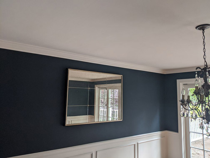
From neutral shades that provide a timeless backdrop, such as white walls, to earthy tones that bring warmth and a sense of grounding, a wide range of neutral paint colors has gained popularity. These versatile hues serve as a foundation, allowing you to incorporate pops of color and personal touches as desired.
By delving into the intricacies of the color wheel and understanding color psychology, you gain the confidence to select wall colors that harmonize and reflect your vision for each space. Whether you opt for complementary contrasts or opt for the subtlety of analogous hues, your newfound knowledge empowers you to create an interior that truly feels “just right.”
Choose a Base Color
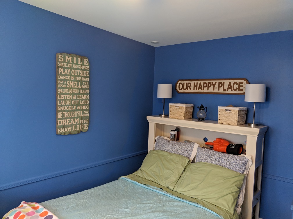
Start with a warm and inviting shade that will set the tone for the rest of your decorating. When choosing the right hue, there are a few tips to keep in mind. First, consider the mood you want to create in each room. Do you want it to be cozy and intimate or bright and energizing? This can help guide your color selection.
Another important factor is undertones. Even if two colors look similar on their own, they may have different undertones that can clash when paired together. For example, a beige with pink undertones may not work well with a gray with blue undertones. To avoid this issue, bring home paint samples and compare them in different lighting situations throughout the day before making your final decision on a base color. By keeping these tips in mind, you can choose a base color that sets the perfect foundation for your interior design scheme.
Create a Color Scheme
Now that you’ve chosen your base color, it’s time to create a color scheme for your house interior. There are various options available, such as the monochromatic scheme, analogous scheme and triadic scheme. The monochromatic scheme involves using different shades of the same color, while the analogous scheme uses colors that are adjacent to each other on the color wheel. On the other hand, the triadic scheme combines three colors that are evenly spaced on the color wheel for a vibrant and dynamic look.
Add Complementary Accents
Now that you have your color scheme in place, it’s time to add those complementary accents that will really bring your space to life! One easy way to do this is by incorporating throw pillows and blankets into your decor. Not only do they add visual interest, but they also provide a cozy element to your room. Another way to add some texture and warmth is by introducing rugs and curtains that play off of the colors in your scheme. And finally, don’t forget about artwork and decorative pieces – these can really tie everything together and give your space that extra touch of personality.
Tips for Successful Implementation
When implementing your house interior color combinations and complementary accents, there are a few tips to keep in mind. First, consider the lighting in the room as it can greatly affect how colors appear. Secondly, balance your colors and accents throughout the space to create a cohesive look. Lastly, don’t be afraid to experiment with different combinations until you find what works best for you.
Consider Lighting
To really make your interior colors and accents pop, don’t forget to take into account the lighting in each room. Proper lighting placement can enhance the look of any color combination you choose, while incorrect lighting can leave a room feeling dull or even washed out. Here are some things to consider when it comes to lighting:
- Lighting Placement: Consider where your light fixtures are placed and how they illuminate different areas of the room. A well-placed light fixture can highlight a statement piece or accent wall, while too much overhead lighting can create harsh shadows or make a space feel flat.
- Natural vs Artificial Lighting: It’s important to consider both natural and artificial light sources when selecting your color palette. Natural light may bring out certain hues more than others, while artificial light such as LED bulbs may cast a cooler or warmer tone on your walls and accents.
By taking these factors into consideration, you’ll be able to choose an interior color scheme that truly shines with the perfect complement of lighting.
Balance Colors and Accents
Achieving a harmonious balance between your chosen colors and accents can evoke a sense of visual satisfaction and cohesiveness in any space. To achieve this, consider harmonizing textures to create depth and interest in the room. Adding different textures such as wool or linen to your furniture, curtains, or pillows can break up monotony and add dimension to the room.
Another way to balance colors is by incorporating natural elements that complement each other. For instance, pairing brown wood floors with warm beige walls will help create an earthy atmosphere that feels cozy and inviting. Similarly, combining green houseplants with blue accent pieces will bring a refreshing touch of nature into your home while also creating a calming ambiance. By thoughtfully balancing colors and accents in your interior design, you can transform any space into an oasis of comfort and beauty.
Don’t Be Afraid to Experiment
Go ahead and try out new combinations of textures, patterns, and materials in your decor to create a unique and visually stimulating space that reflects your personality. Don’t be afraid to experiment with different color palettes beyond the traditional neutrals or safe options. Experimentation benefits you by allowing you to discover what works best for your personal style.
To fully embrace experimentation in your interior design, consider these tips:
- Start small: Incorporate a bold accent piece or wallpaper into a neutral room.
- Mix and match: Combine unexpected colors and patterns for a playful yet cohesive look.
- Think outside the box: Try unconventional materials such as recycled wood or metal accents to add texture and depth.
Remember, the goal is not just about following trends but rather creating a space that speaks to who you are. So go ahead, take some risks, and let your creativity shine through in your home’s decor!
Final Thoughts
So there you have it, your guide to choosing the perfect color combinations and complementary accents for your house interior. Remember to start by understanding the color wheel and choosing a base color that sets the tone for the entire space. From there, create a color scheme that balances both warm and cool tones.
Don’t forget to add complementary accents that bring out the best in your chosen colors. Whether it’s through textiles, artwork or decorative pieces, these finishing touches can make all the difference in creating a cohesive and aesthetically pleasing home environment. With these tips in mind, you’re well on your way to transforming your living space into a beautiful haven that reflects your personal style.